Decorating and refreshing your home is an exciting process, but it can also be very challenging if you’re not an expert.
Below, Vogue summarizes 7 common mistakes when renovating your living space that can result in aesthetic outcomes different from your expectations.
Furniture against the wall
This is one of the most common mistakes in design. Placing all furniture against the wall does not create a sense of spaciousness for the room. In fact, having too much empty space can create imbalance. Placing some furniture in the middle of the room will help create focal points and make the space feel warmer and more inviting.
Insufficient lighting
Dim lighting reduces the aesthetic appeal of the space and also affects the emotions and mood of the people living in it.
To improve the lighting in your home, you can simply replace some light bulbs with ones that provide better lighting, or add some wall sconces. After that, you will see a significant improvement in your room.
You should also diversify the light sources in your home. For example, you can install ceiling lights to illuminate surfaces such as tables and paintings; floor lamps provide light for the corners of the room.
In addition, task lighting such as desk lamps or reading lamps should be invested in to meet relaxation and work needs.
Inaccurate measurements
One of the most common mistakes people make is measuring the space by eye. This mistake can lead to buying furniture that is the wrong size.
Therefore, before designing, it is important to measure every corner of the space. More importantly, buy furniture based on the dimensions of the space, not just because it looks good.
Lack of symmetry
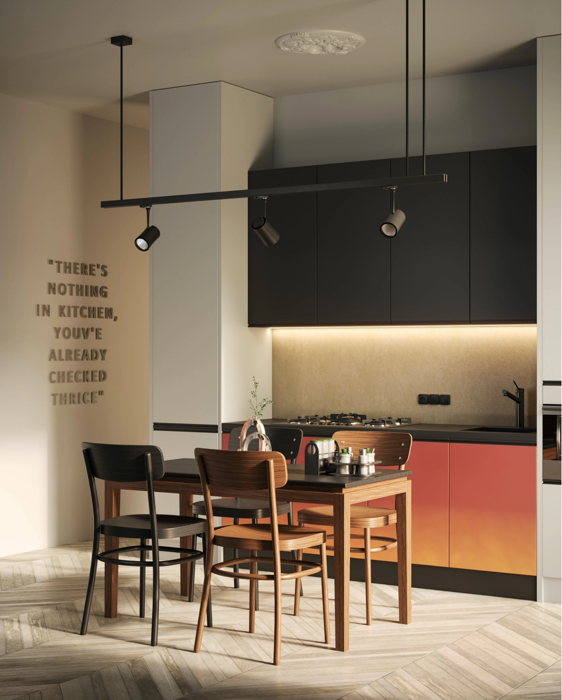
The space will lack a sense of balance without symmetry. Symmetry can be seen in many details in the house, from lighting to furniture.
To arrange furniture symmetrically, measure and determine an even divide for the room. Then, arrange the furniture from the outside in along the established divide.
Choosing the wrong rug size
A rug is considered fitting if it covers at least 2 feet of the chairs or sofa. The living room rug should be about 2.4×3 m. For bedrooms or hallways, a rug size of 1.2×1.8 m would be suitable.
Hanging artwork too high
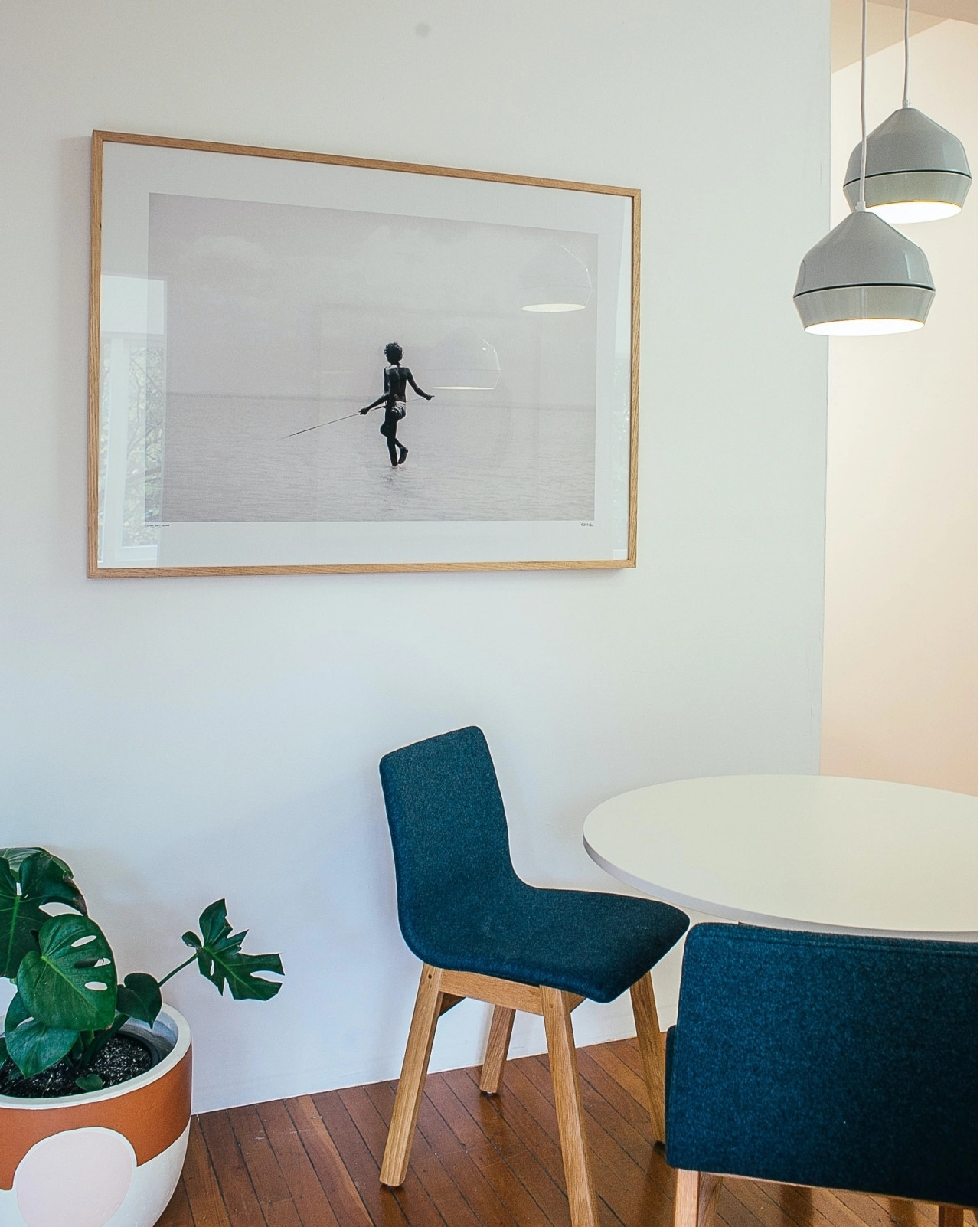
Many people think that hanging artwork high will make it more prominent. In reality, the most appropriate distance is eye level.
Therefore, you can easily admire the front of the artwork. In addition, avoid hanging artwork on all walls as it can become monotonous.
Furniture too big or too small
Oversized furniture in a small space can make the room look cramped. On the other hand, undersized furniture in a large space will leave too much empty space.
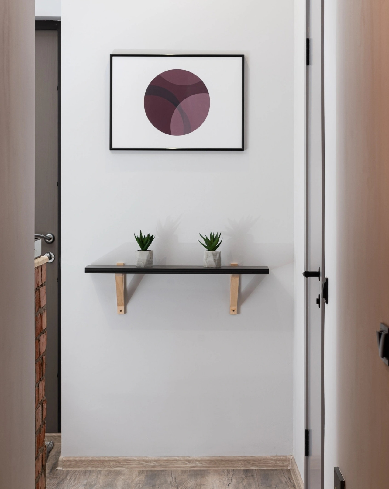
The spacing between furniture is also important. For example, in the living room, furniture should be placed about 76-92 cm apart. For smaller spaces like apartments, this distance can be 46-60 cm.
According to Zing
Tips for Relief from Eyestrain and Dry Eyes Resulting from Prolonged Screen Use
Do you ever feel like your eyes are overworking? This is a common symptom of eye strain, which can include temporary blurred vision and dryness of the eyes. Read on with Dien May Xanh to get tips on how to cope with eyestrain and dryness in the eyes that comes with prolonged use of laptops, computers, and phones.


